
I love monochrome, so this challenge from Paula suits me nicely. I’ve gone with a Film Noir attempt here:
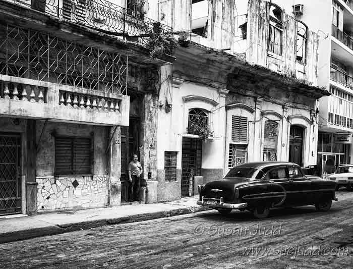
Mean Streets, or ‘The Getaway Car’
And this is the colour version, nothing like so moody:
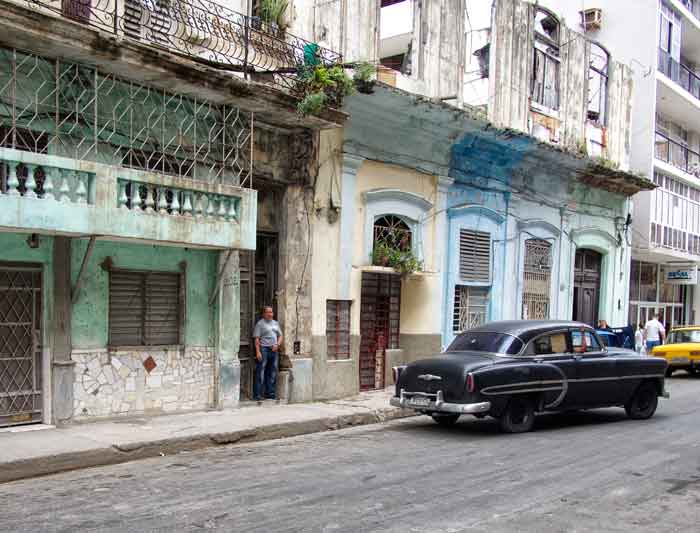
Just another view of downtown Havana….
Well, it’s all a bit of fun, and you can see more examples at Paula’s here.

Good example, Sue. Much better in B&W!
Best wishes, Pete.
Thank you, Pete! I could see the original had potential….
Oh, I do like the monochrome image much better than the colour version. Looks gritty and the car looks better with the added shine. That chap looks as though he has clocked you and is going for his gun 😉
Excellent! Job done! Thanks, Jude 😊
Ditto the moodiness. 🙂
😀😀
I like the impression the b & w gives off.
DJ
Thank you, Danny!
Simply tremendous in the monochrome version.
Thank you, Tosh – glad you like it! It was a bit of fun creating it to match my vision…
Both are equally as gorgeous.
Thank you!
So much more atmospheric in mono – great image, Sue.
Thank you, Robin!
Your attempt is completley successful, Sue, even for someone who generally prefers color.
janet
I don’t necessarily prefer colour, just too lazy at times…..
B&W implies a story in a way colour doesn’t quite.
With monochrome we concentrate on the elements of the image, with colour we are drawn to, well, the colours!
I like the B&W better until I know it is Havana – then it has to be in color.
No it doesn’t, if I want to tell a story…. 😀
A very successful attempt!
Thanks, Gilly – I had a lot of fun creating this!
Pingback: BLACK & WHITE SUNDAY: AFTER AND BEFORE Y1-04 | Lost in Translation
When I think of Cuba (the country I never visited) I “see” it in colour, but I do love and even prefer your monochrome edit here. Sorry I could not log on yesterday. Thanks, hon.
No worries, Paula! Glad you like my noir!
I love it, and I look forward to seeing more from that shop 🙂
Did you see my silent Sunday?
As soon as I complete my morning round with the entries for B&W Sunday, I will check it out.
😊
I love the grittiness of the B&W version, Sue.
Thank you, Andy!
A shame to waste good colour on all that decrepitude, Sue 🙂 🙂
😂 splutter, splutter! You do make me laugh, Jo!
No good having a long face, is it? 🙂 🙂
Absolutely not! Anyway, did you like that image, despite no colour? Did it have atmosphere?
Oh, well, if you wanted a conventional answer… 🙂 🙂 That’s what you have all your dilapidation fans for, but yes- it did!
Excellent!
Very nice and a very good conversion!
Many thanks, Pat! Good old SilverEfex’